HOW TO DRAW A CROISSANT
Photographs and sketches of a deconstructed croissant, aimed to demonstrate the effectiveness of sectional representation as a technique. Each section was then reconstructed into an isometric view which was drawn without using the croissant as a reference.


14-03-2022
FLATNESS vs PROJECTION
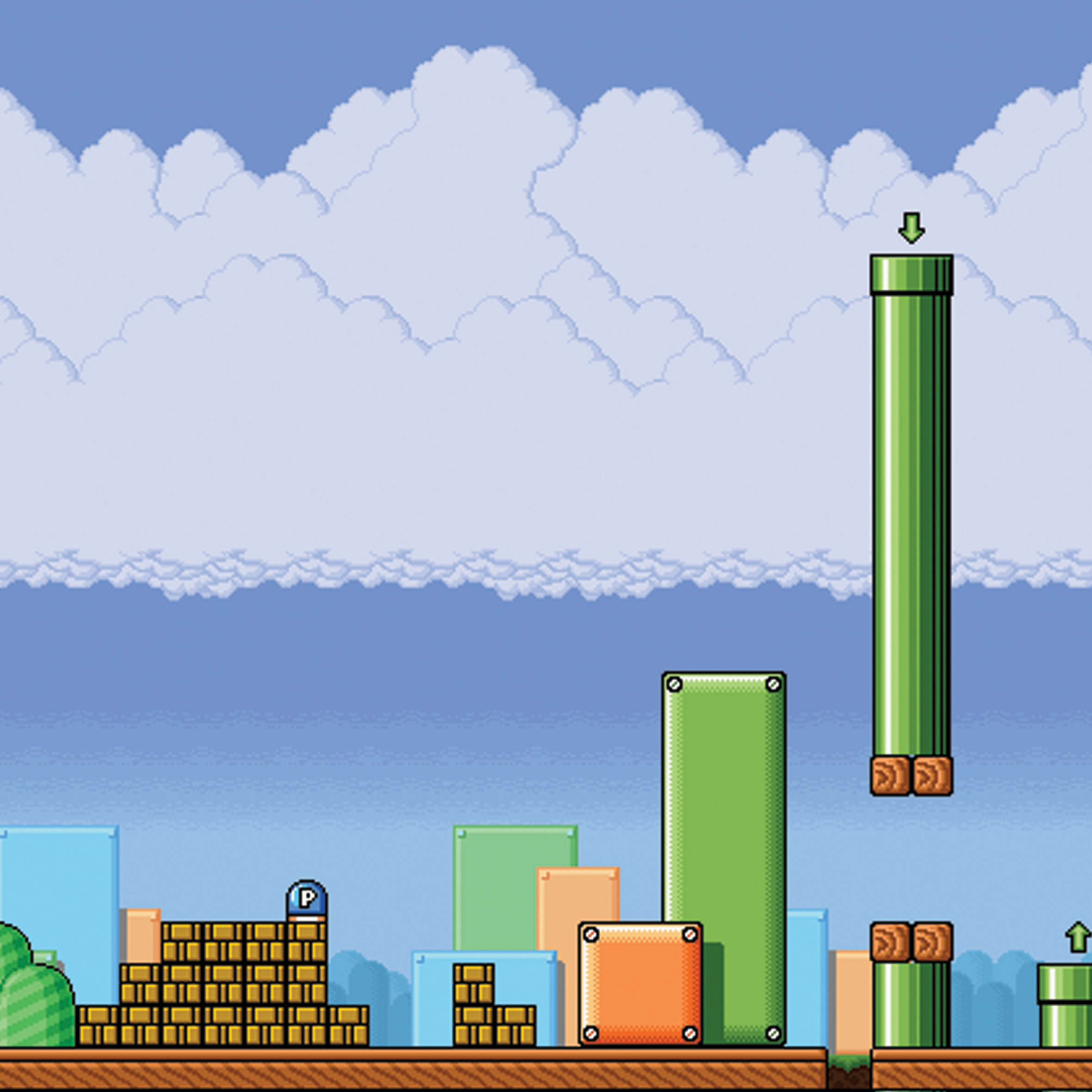
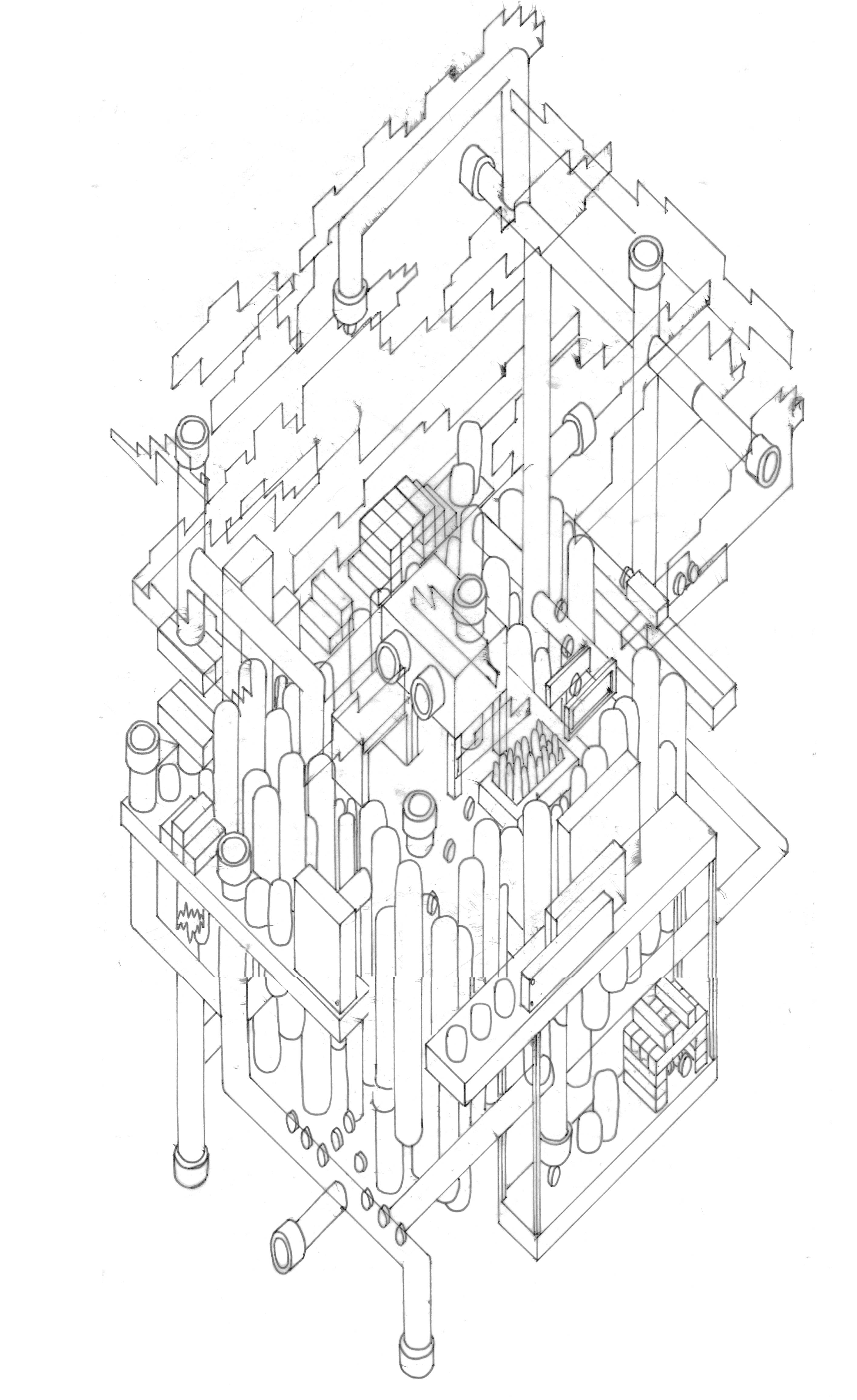
An isometric reconstruction of two still frames taken from the retro Super Mario. Using the still images, the internal space created was completely imaginative, however had to reflect accurately what was shown or implied in each image. This was initially sketched by hand and later traced and coloured using Adobe Illustrator.


04–04–2022
SURFACE vs PATTERN
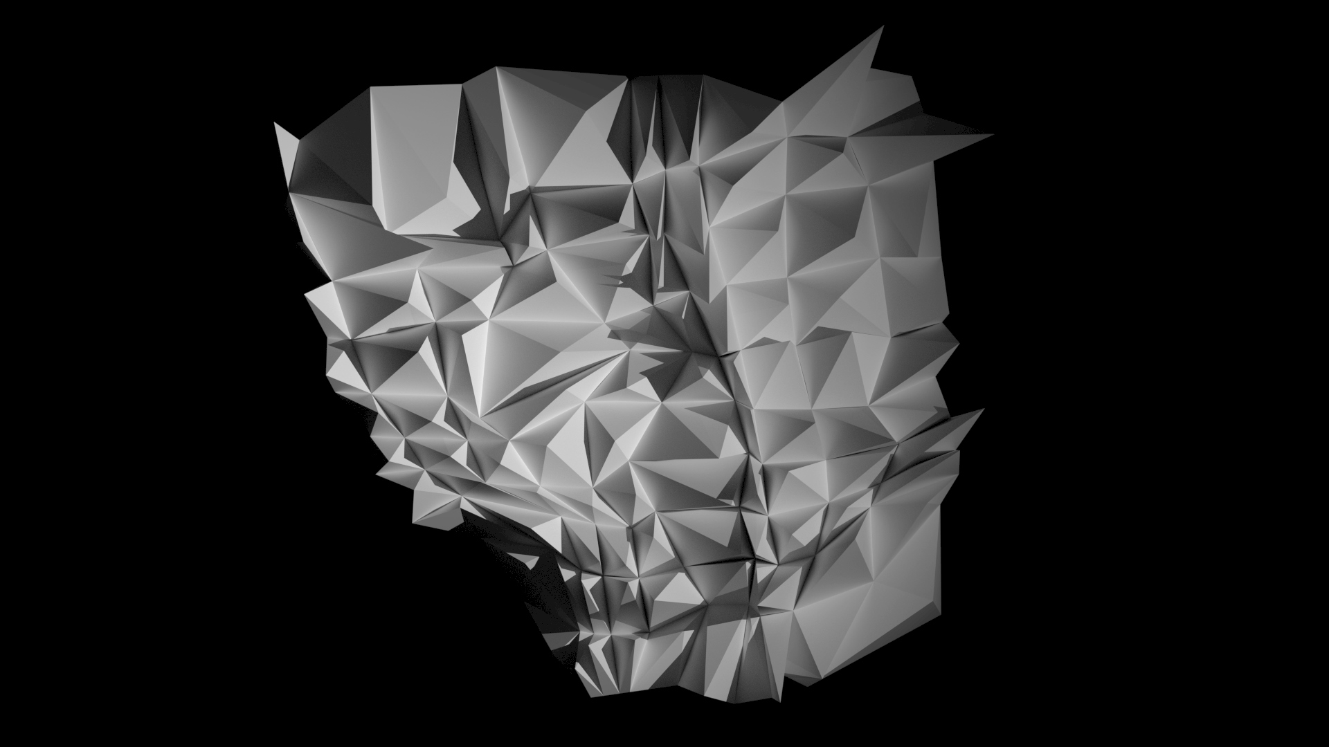
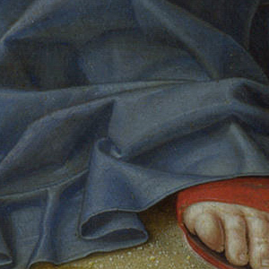
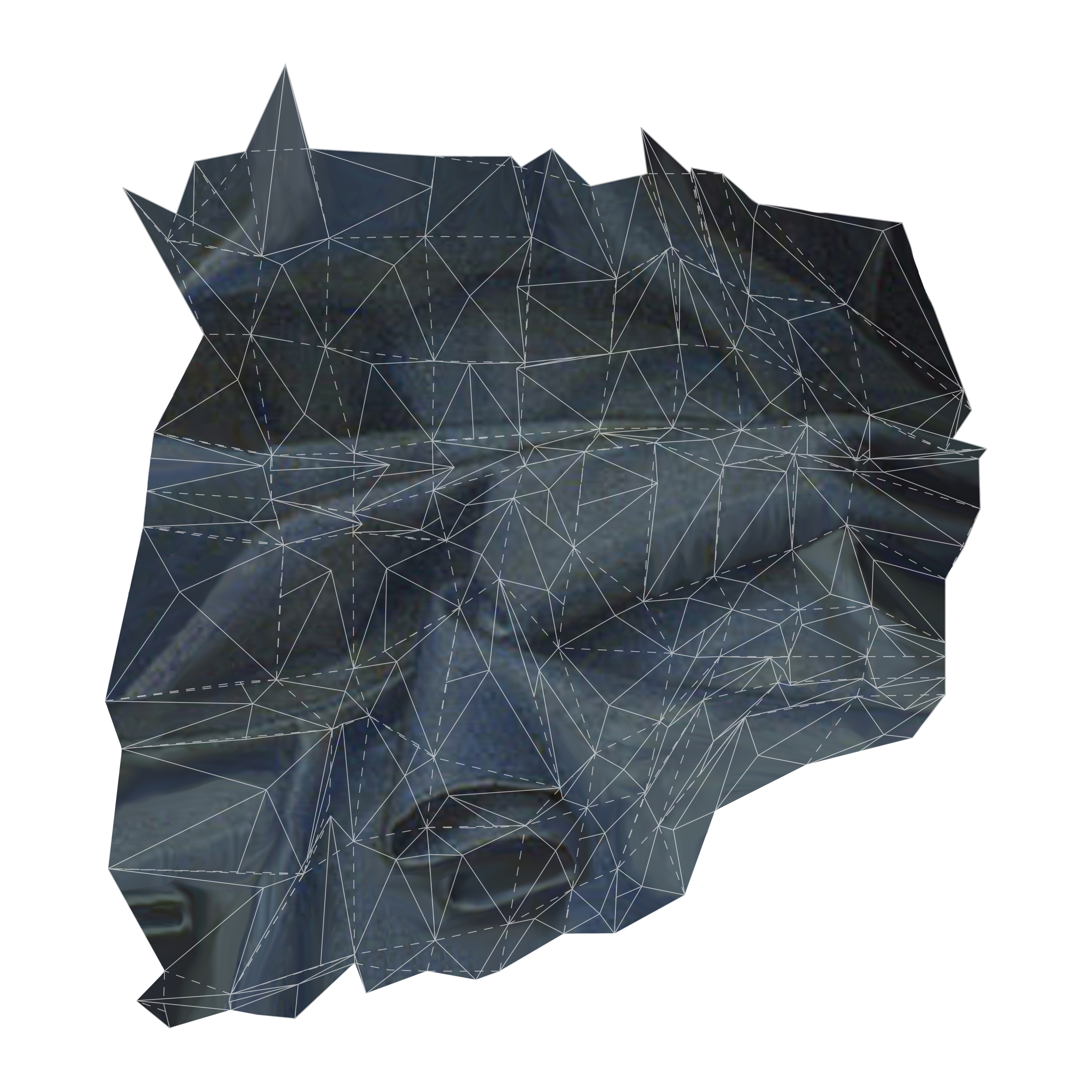
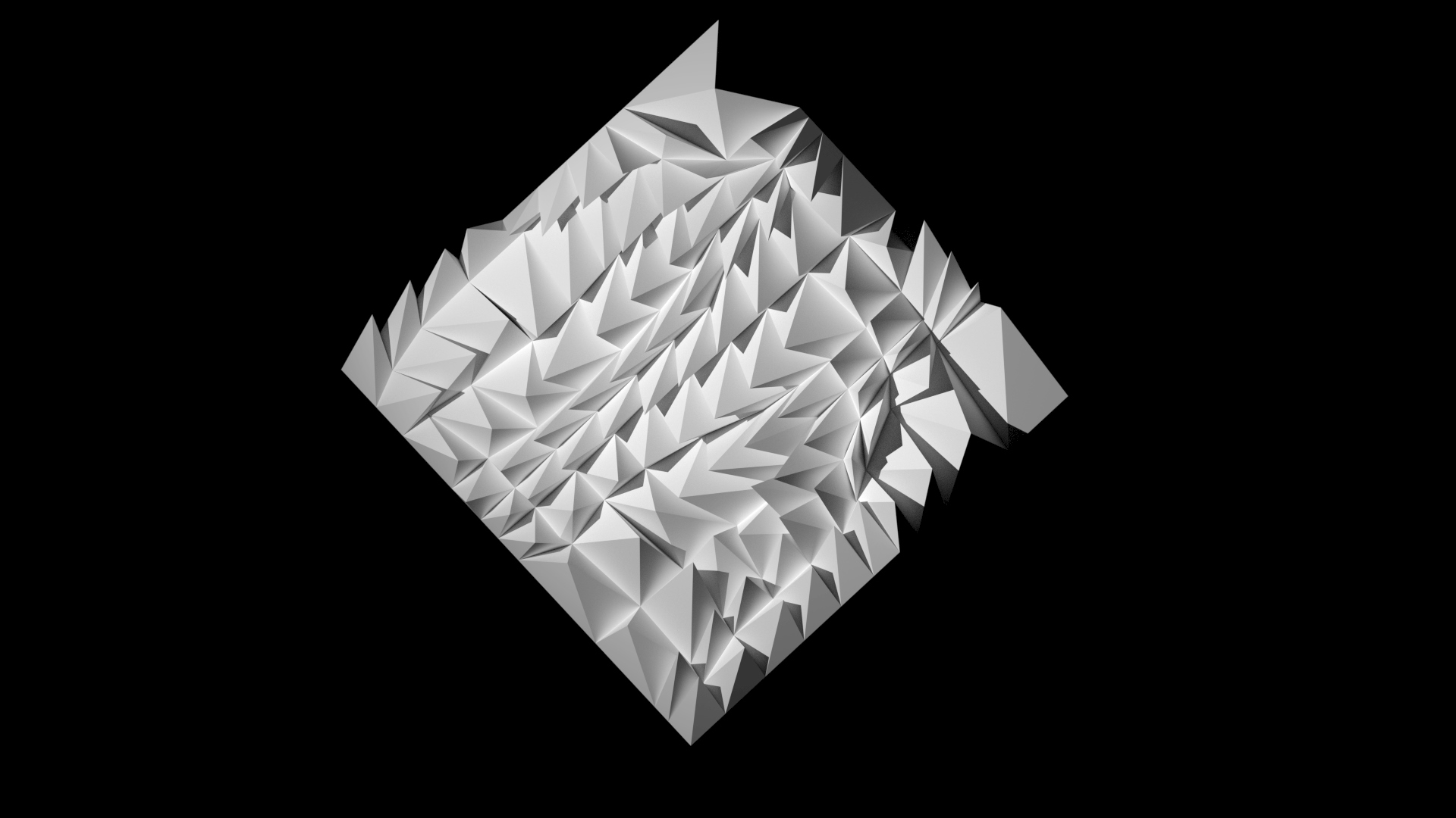
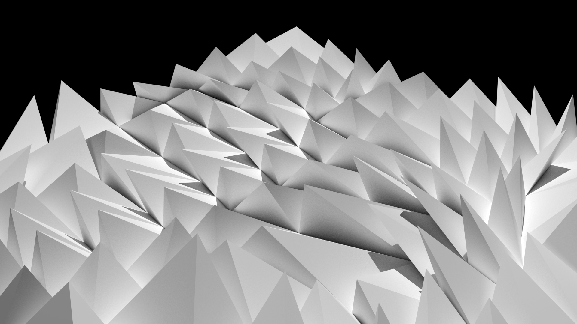
Creating a constructible surface from a 10x10 grid that accurately represented a fabric sample. The pattern was created using a combination of commands that arrayed each section of the grid, trying to emulate the light, shade, scale and folds of the fabric in each motion.


02–05–2022
FRAME vs FIELD
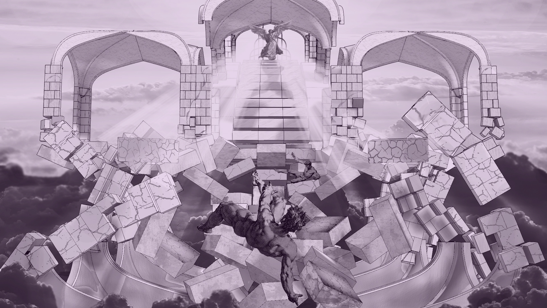
Using a 3D model of The University of Melbourne’s ‘Old Quad’, this project required manipulation of the model to accurately re-tell a provided story visually. After choosing two quotes, the model then needed to be rendered in Photoshop to accurately tell each quote. Temporal and atmospheric lines were then over-imposed on the isometric view to help with the story-telling.


23–05–2022
MODULAR TYPEFACE
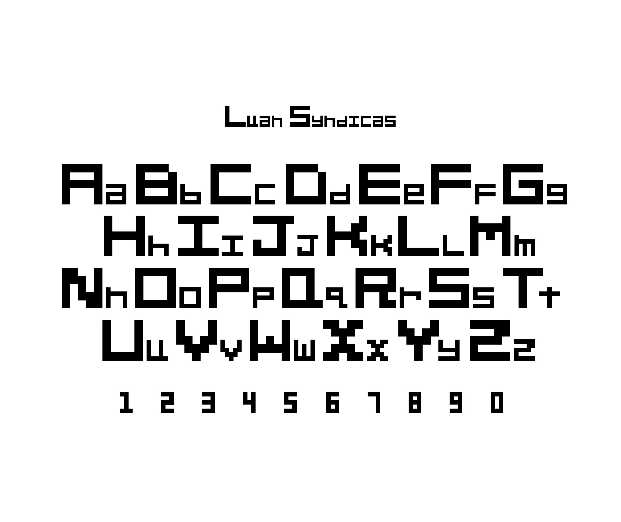
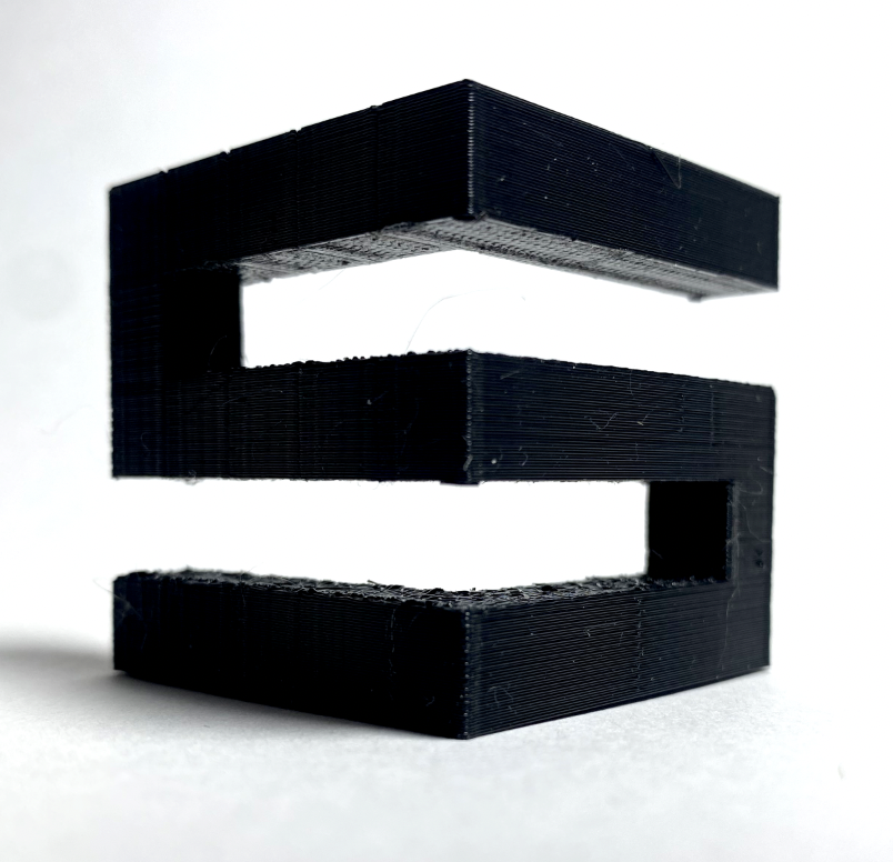
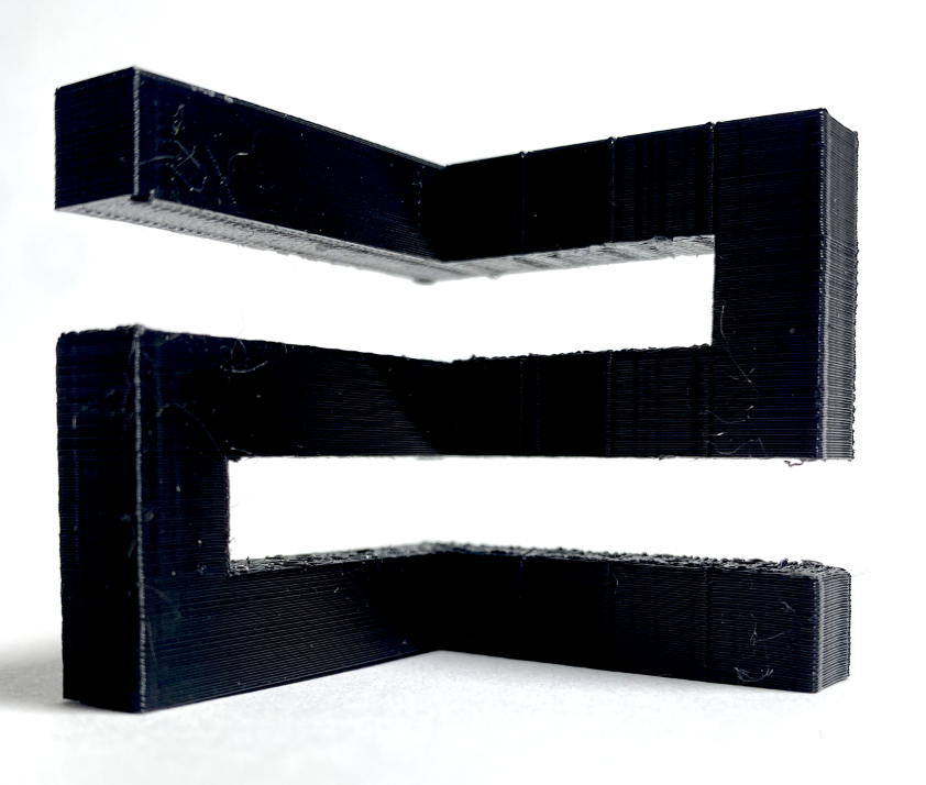
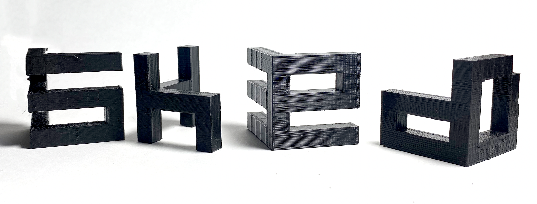
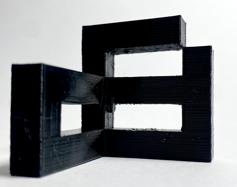
A typeface made out of the same constituent parts, using a 5x5 grid, that would allow for use inversely. The typeface was then constructed in 3D so that each block contained the upper-case and lower-case variation of each letter, meaning that only 26 blocks were printed rather than 52.






29–08–2022

